Introduction
Numbers are everywhere in daily life — from business reports and school scores to health indicators and financial markets. Whenever something can be counted or measured, you’re dealing with numerical data. It provides clarity, allowing us to see reality in measurable terms rather than vague descriptions.
Numerical data — also called quantitative data — is information that can be measured and expressed in numbers. Unlike categories or names, numerical data lets us quantify observations and perform mathematical operations such as addition, subtraction, and averaging.
Characteristics of Numerical Data
- Measurable → Represents quantities that can be counted or measured.
- Numeric → Expressed in integers or decimals.
- Mathematical → Can be used in operations like addition, subtraction, averaging, etc.
Examples:
- Rainfall amount
- Electricity bill
- Weight
- Temperature
- Heart rate
- Marks scored in exam
- Population of a city
Why Numerical Data Matters
Numerical data is essential because it gives us measurable facts instead of vague opinions. It supports analysis, comparison, and decision-making in almost every area of life. Its importance can be understood in several ways:
- Spotting Patterns → By collecting numbers over time, we can reveal hidden trends. For example, rainfall measured month by month shows seasonal changes clearly.
- Making Comparisons → Numbers allow us to evaluate differences. Electricity bills, sales figures, or exam scores can be compared across months or years to understand change.
- Guiding Decisions → Numerical data provides a reliable foundation for choices. Travel times, customer counts, or budget figures help us choose wisely instead of guessing.
- Tracking Progress → Whether saving money, monitoring health, or measuring business growth, numbers show where we are and how much we’ve advanced toward our goals.
What are the Categories of Numerical Data
Numerical data is broadly divided into two main types: discrete and continuous. Each type has its own characteristics and is best suited for different kinds of analysis.
- Discrete Data → This type of data is made up of countable values. It represents quantities that can only take specific, separate numbers — usually whole numbers. You cannot have values in between.
- Examples: number of students in a class, total cars in a parking lot, books borrowed by students.
- Key Point: Discrete data is about counts, and is often best shown with bar charts, dot plots, or pie charts.
- Continuous Data → This type of data can take any value within a range. It is usually obtained through measurement, meaning fractions and decimals are possible. The values can be precise and show smooth variation.
- Examples: height of a person, weight of an object, time taken to complete a task, temperature during the day.
- Key Point: Continuous data is about measurements and variation, and is best visualized with histograms, line charts, or box plots.
Comparison: Discrete vs Continuous Data
| Aspect | Discrete Data | Continuous Data |
|---|---|---|
| Definition | Data that takes countable, distinct values (often whole numbers). | Data that can take any value within a range, including decimals and fractions. |
| Examples | Number of students in a class, cars in a parking lot, books borrowed. | Height of a person, weight of an object, time taken to finish a task, temperature. |
| Values allowed | Usually integers; no fractions/decimals between counts. | Can be integers, fractions, or decimals within the range. |
| Nature | Based on counts. | Based on measurements. |
| Visualization | Best shown using bar charts, pie charts, or dot plots. | Best shown using histograms, line charts, or box plots. |
What is Numerical Data Analysis
Numeric Data Analysis is the study of number-based information to uncover trends, relationships, and insights. It deals with quantitative data — values that can be counted or measured, such as age, income, sales, or temperature.Visualize data — with charts and graphs to spot patterns.
It includes:
- Summarizing data with averages, minimum and maximum values, variation (range or standard deviation), totals, and percentages and finding abnormal numbers (outliers).
- Visualizing data using charts to reveal trends and distributions.
- Comparing values across groups or time periods.
- Making decisions based on clear, fact-driven evidence.
Numerical data analysis can be in two ways: descriptive and visual analysis.
Descriptive Numerical Data Analysis
Descriptive Numeric Data Analysis summarizes numerical data through descriptive statistics to show what’s typical and how the values vary. It helps us understand the average, most common, and spread of the numbers using tools like mean, median, mode, range, and standard deviation.
Central Tendency: Finding the Typical Value
Central tendency shows the typical point in data — where most values gather, giving a quick sense of what is normal or expected.
- Mean → Represents the overall average of the data. Useful for understanding balanced datasets, but can be affected by extreme values — very high or very low numbers (e.g., Scores 70, 80, 90 → Mean = 80).
- Median → Shows the central position when data is ordered. Provides a better “typical” value when extreme values are present (e.g., Scores 40, 50, 100 → Median = 50).
- Mode → Identifies the most common observation in the dataset. Helpful for categorical or repeating numeric data. (e.g., most students wear shoe size 8).
Variation: Understanding the Spread
Variation shows how spread out or close together the data values are around the center or from typical value, helping us see the consistency or diversity in the dataset.
- Minimum & Maximum → Smallest and largest test scores – e.g., Scores range from 40 (min) to 100 (max).
- Range → Difference between them (100 − 40 = 60).
- Variance → Average squared distance from the mean (e.g., scores 40, 50, 60 → variance ≈ 66.7.).
- Standard Deviation → Typical distance from the mean, easier to interpret than variance (e.g., scores 40, 50, 60 → SD ≈ 8.16).
Below table presents numerical data summarized through descriptive statistics.
| Category | Data (Scores) | Mean | Median | Mode | Min–Max | Range | Std. Dev. |
|---|---|---|---|---|---|---|---|
| Class A | 75, 78, 80, 82, 85 | 80.0 | 80 | – | 75–85 | 10 | 3.5 |
| Class B | 45, 50, 48, 95, 98 | 67.2 | 50 | – | 45–98 | 53 | 24.5 |
| Class C | 60, 62, 65, 68, 70, 72, 74, 76, 78, 100 | 72.7 | 71 | – | 60–100 | 40 | 11.6 |
Visual Numerical Data Analyis
Visualizing numerical data is important because it helps us quickly understand patterns, counts, and distributions. The type of visualization depends on whether the data is discrete or continuous.
Discrete Numerical Data Visualizations
Discrete data consists of countable, distinct values, usually whole numbers. You cannot have fractions or decimals between these values because they don’t make sense in context.
Best Charts → Bar charts or pie charts for discrete data show how many students borrowed each amount.
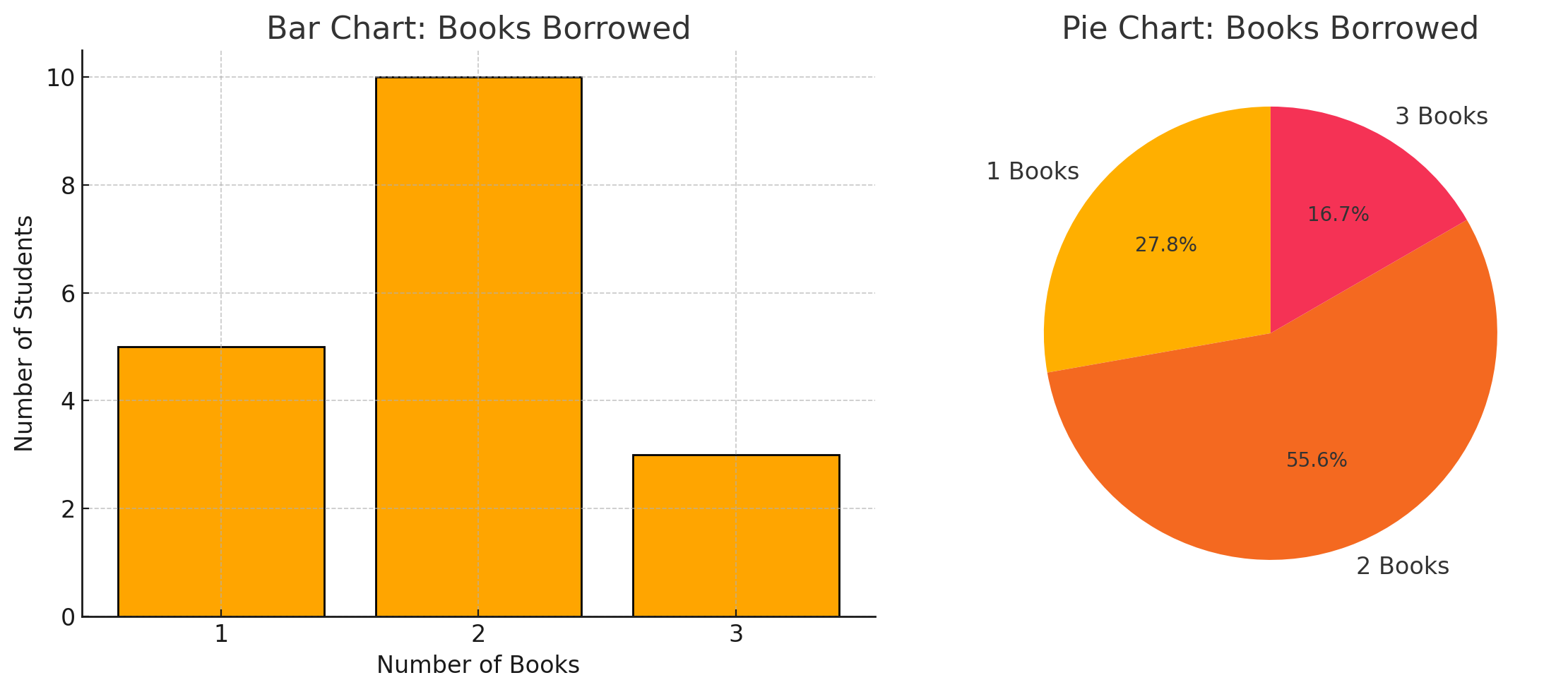
Figure: Comparison of students borrowing 1, 2, or 3 books.
Insight: For example, a bar chart could show that “2 books” is the most common, borrowed by 10 students, while fewer borrowed 1 or 3.
How This Chart Built:
- Data Collection → The dataset recorded how many books each student borrowed (a discrete variable: 1, 2, or 3 books).
Bar Chart (Left)
- The x-axis shows the number of books borrowed (1, 2, or 3).
- The y-axis shows the number of students in each category.
- Each bar represents how many students borrowed that amount. For example, 10 students borrowed 2 books, while only 3 borrowed 3 books.
Pie Chart (Right)
- The same data was converted into percentages of the total.
- Each slice of the pie shows the proportion of students in each group (e.g., 55.6% borrowed 2 books).
- The chart provides a quick sense of how big each group is relative to the whole.
Continuous Numerical Data Visualizations
Continuous data can take any value within a range, including fractions and decimals. Unlike discrete data, it allows for smooth variation, meaning values can change gradually along a scale. In everyday life, most of the numbers we encounter fall into continuous numerical data type.
Best Charts → Use histograms to show how many values fall within each range, while box plots and line charts highlight the spread and overall trends.
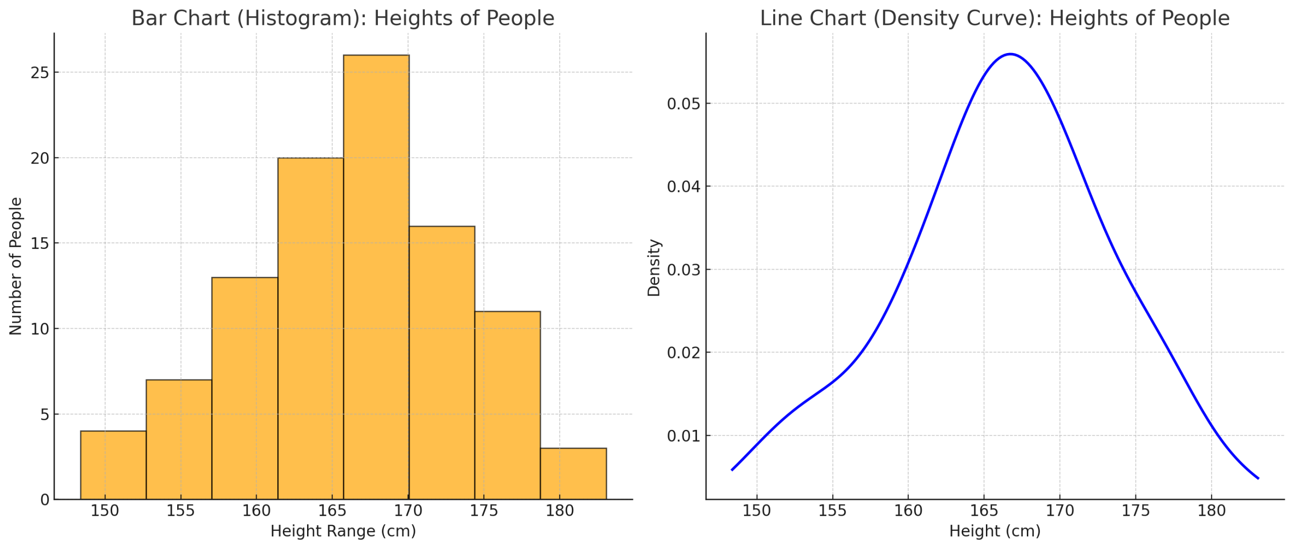
Figure: Continuous numerical data distributions.
Insight: A histogram of heights might reveal that most people fall between 160–170 cm, with fewer outside this range.
How This Chart Built:
- Data Collection → Heights of people were recorded in centimeters;values like 165.4 cm, 170.2 cm, and so on (continuous numerical data).
Histogram (Left Chart)
- The height values were grouped into ranges (called bins), such as 150–155 cm, 155–160 cm, and so on.
- The bars represent the number of people in each range. Taller bars mean more people fall within that height range.
Line Chart / Density Curve (Right Chart)
- Instead of grouping values into bars, a density curve was drawn.
- The curve shows the overall shape of the distribution, peaking where most people’s heights are (around 165–170 cm) and tapering off toward shorter and taller values.
Finding normal numbers in visualizations:
A normal value refers to the “typical point” in a dataset. It shows the central area where most data points gather, making it easier to understand what is usual, common, or expected in the data.
Example:
If five people earn $30k, $35k, $40k, $45k, and $50k, the mean is: [(30 + 35 + 40 + 45 + 50) ÷ 5 = $40k]
Here, we see symmetrical data where the values are balanced and clustered around the average
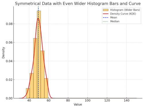
Figure: A symmetrical numerical data distributions.
Chart Insight:
A red line curve appears symmetrical — not skewed — when there are no extreme values.
Finding abnormal numbers in visualizations – data skewness:
Sometimes, a few extreme values can distort the overall picture of data. This effect is called skewness, and it occurs when charts lean to one side instead of staying balanced around the average. Skewness highlights how abnormal numbers influence the shape of the data, making it important to recognize when interpreting results.
Because of these extreme values, charts can show skewness in two main ways:
Right Skew (Positive Skewness)Right skewness (positive skew) occurs when extreme values lie on the right side of the distribution. These larger-than-average values pull the mean upward, which can create a false impression of the “typical” value.
Example:
If one person earns $1,000,000, the mean shoots up to $240k — no longer a fair representation.
Here, we see non-symmetrical data where most values are clustered above the average, while a few very large values pull the data to the right
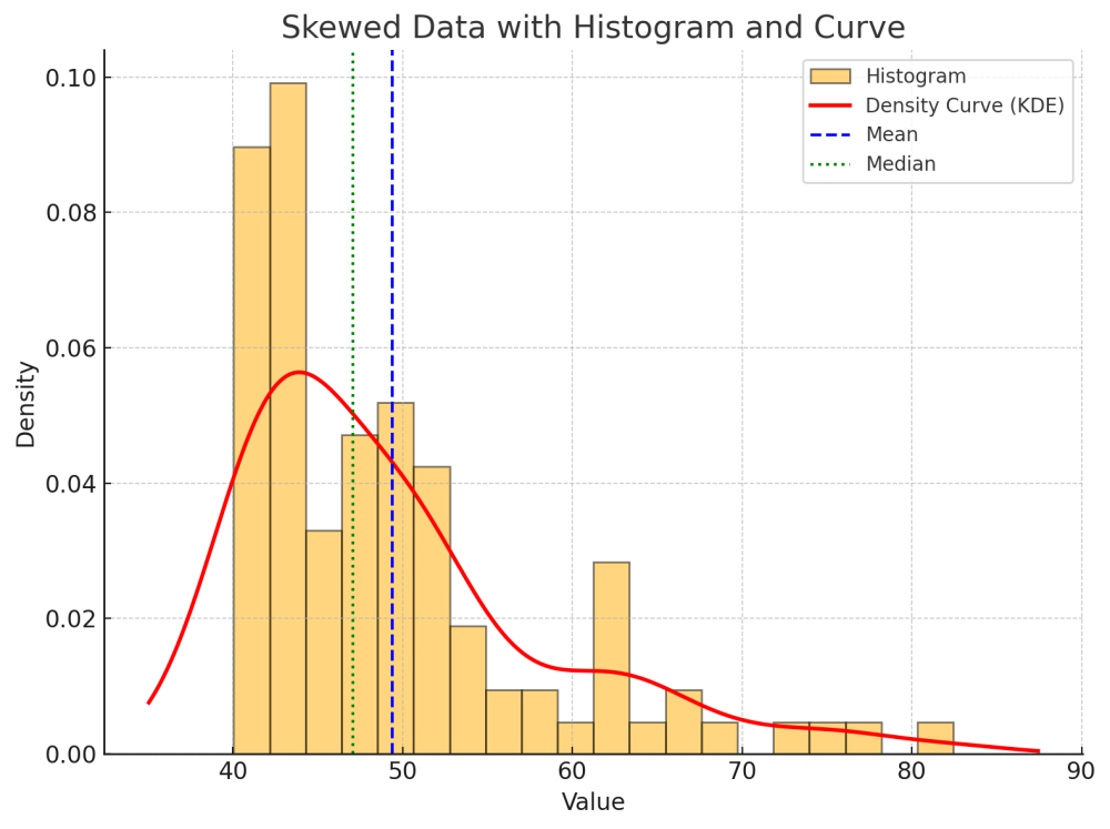
Figure: A Right-skewed numerical data distributions
Chart Insight:
A red line curve becomes skewed (non-symmetrical) when extreme values appear on the right side.
Left skewness (negative skew) occurs when extreme values lie on the left side of the distribution. These smaller-than-average values pull the mean downward, which can create a false impression of the “typical” value.
Example:
If one more persons earns between $1 to 3 then, the mean shoots down around $20k — no longer a fair representation.
Here, we see non-symmetrical data where most values are clustered below the average, while a few very small values pull the data to the left.
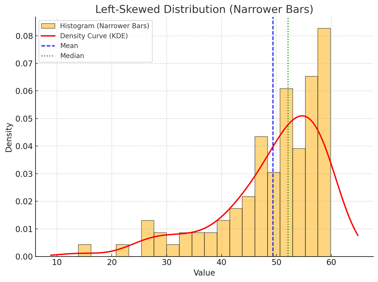
Figure: A left-skewed numerical data distribution.
Chart Insight:
A red line curve becomes skewed (non-symmetrical) when extreme values appear on the left side.
Left vs Right Skewness — Quick Comparison
| Aspect | Left Skewness (Negative Skew) | Right Skewness (Positive Skew) |
|---|---|---|
| Tail direction | Long tail extends to the left (toward smaller values). | Long tail extends to the right (toward larger values). |
| Effect on mean | Mean is pulled below the median. | Mean is pulled above the median. |
| Data cluster | Most values are higher, with a few very low outliers. | Most values are lower, with a few very high outliers. |
| Examples | Retirement ages (most retire late, a few very early). | Income (most earn modest amounts, a few earn very high). |
| Visual look | Peak on the right, tail stretches left. | Peak on the left, tail stretches right. |
Why It’s Important to Know Skewness in Data Analysis
Skewness measures whether your data leans more to the left or right rather than being perfectly balanced. It may sound like a small detail, but knowing the skewness of your dataset is critical for making the right interpretations and decisions.
- 1. Choosing the Right Measure of Central Tendency
- 2. Understanding the Nature of the Data.
- 3. Identifying Patterns Hidden by Averages.
- 4. Improving Accuracy in Analysis.
- 5. Risk Management & Decision-Making.
Conclusion
Numerical data is the backbone of analysis, giving us measurable facts instead of vague impressions. By distinguishing between discrete and continuous numerical data, we can choose the right methods for study and visualization. Descriptive analysis helps summarize averages and variation, while visual analysis makes patterns and outliers easy to spot. Together, these approaches turn raw numbers into actionable insights. In everyday life, from business to education and healthcare, understanding numerical data is essential for making smarter, evidence-based decisions.
Next up, will explore data variation and spread using visual examples